Tala: Know Your Customer
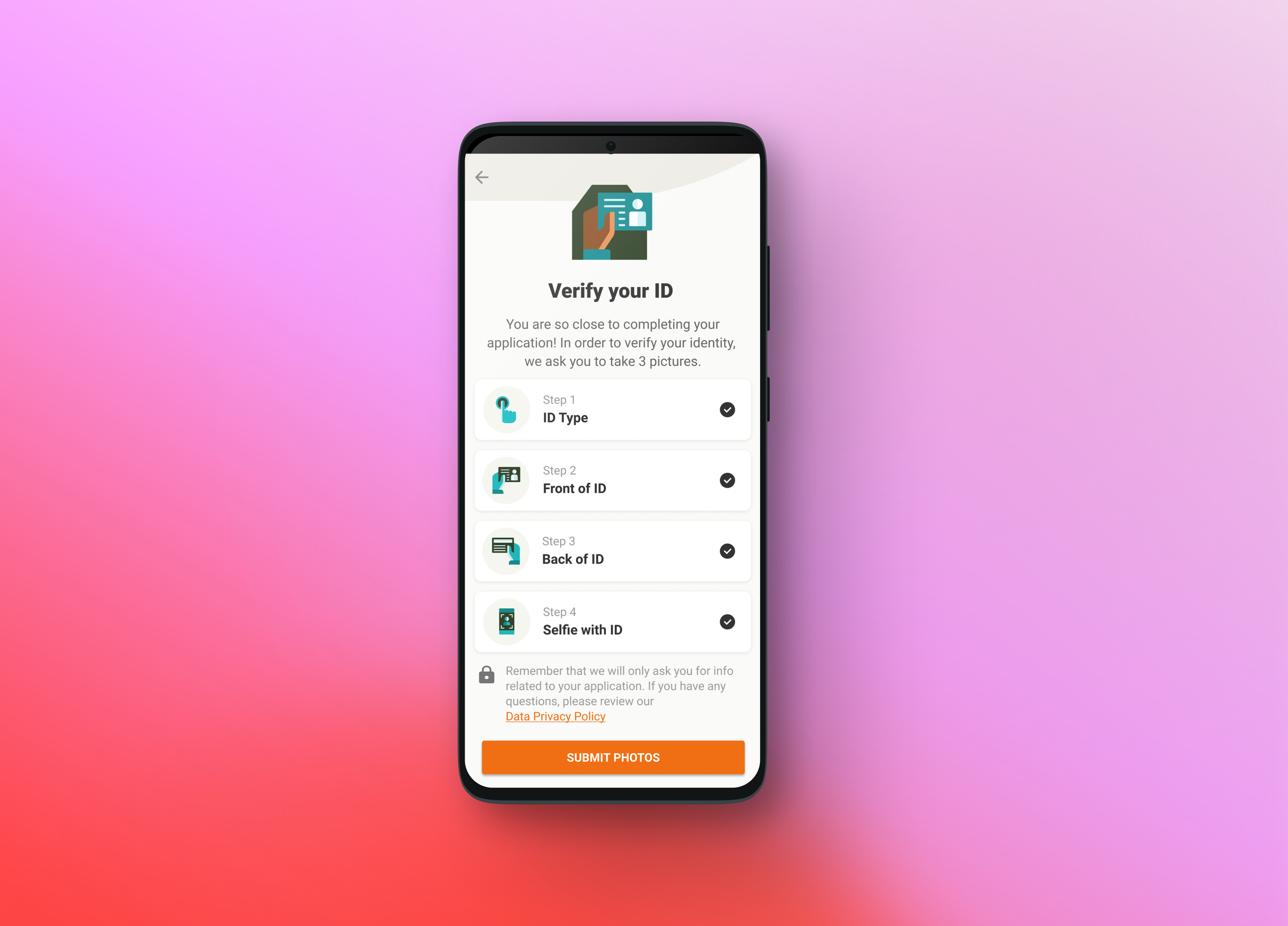
Tala’s KYC (Know Your Customer) is a custom manual process done at Tala to verify a Tala customer in order to either start a savings account or be provided a loan. KYC is completed through the B2C Android app and then verified through a back-end internal program, CARE. It’s a process that most customers will fail either due to not reading the provided instructions or creating drop off due to a lengthy application process. Instant gratification truly is our humanity downfall.
Role: Lead Product Designer
Duration Length: 4 Months (May 2021 - Sept 2021)
Responsibilities: Work with stakeholders, UX researchers, PMs in Philippines and Mexico to understand feasibility, data and complex user problems. Speak with engineers about flow and any other questions that arose. Design UX/UI. Document flows within Figma for handoffs.
P.S to all you creeps, you can Venmo $25 to @jennifercingatura for Figma file access 🫡
Previous Designs
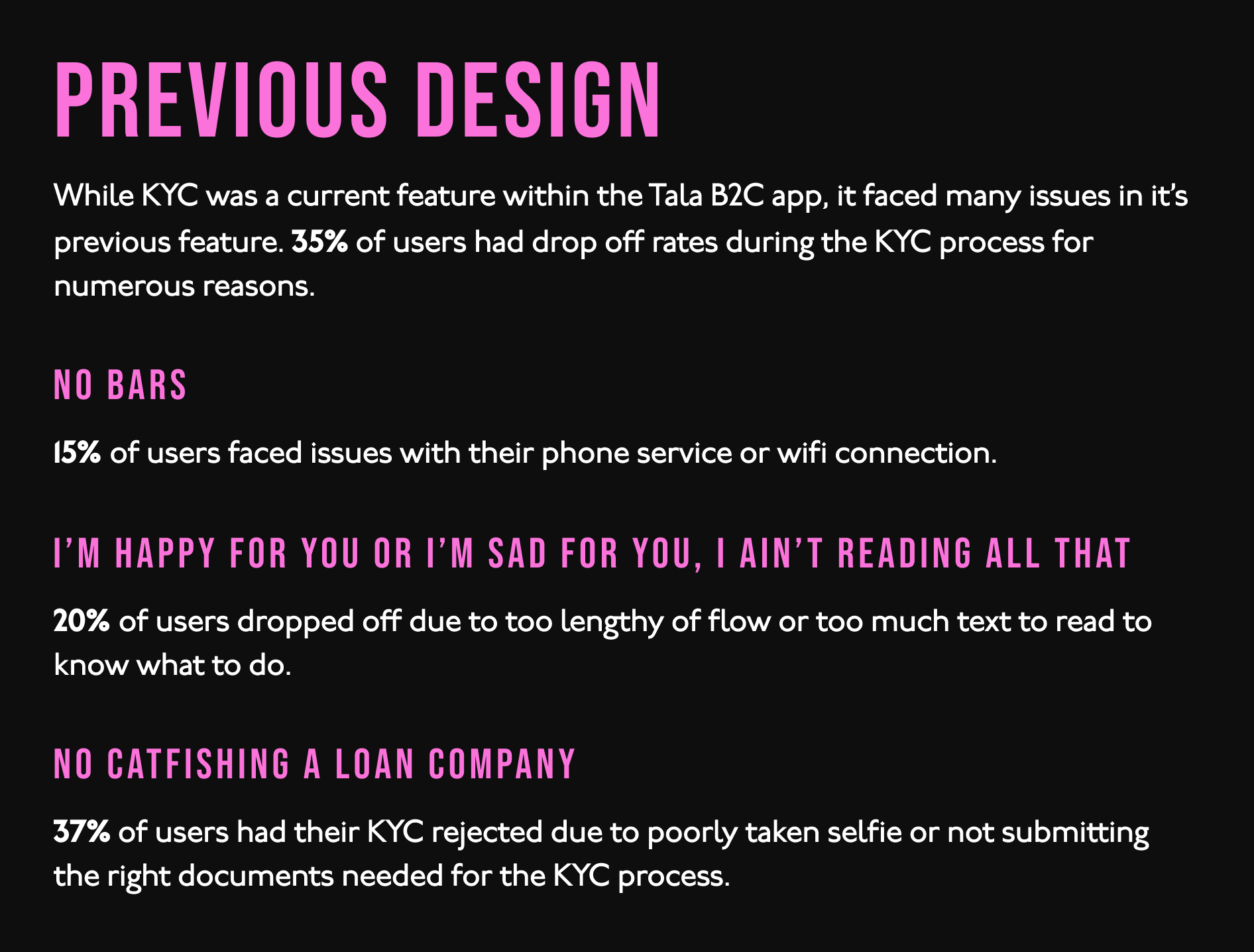
While KYC was a feature within the Tala B2C app, it faced many issues. Nearly 35% of users had drop off rates during the KYC process for numerous reasons. About 15% of user faced issues with their connection to either their phone service or wifi. 20% of user dropped off due too lengthy of flow or having too much text to read to know exactly what to do.
The previous flow also wasn’t visually appealing enough to show users what to do versus telling users what to do. There was also high rate of nearly 37% of users having their KYC rejected due to poorly taken photos or not supporting the right documents needed for the KYC process.
What’s the problem?
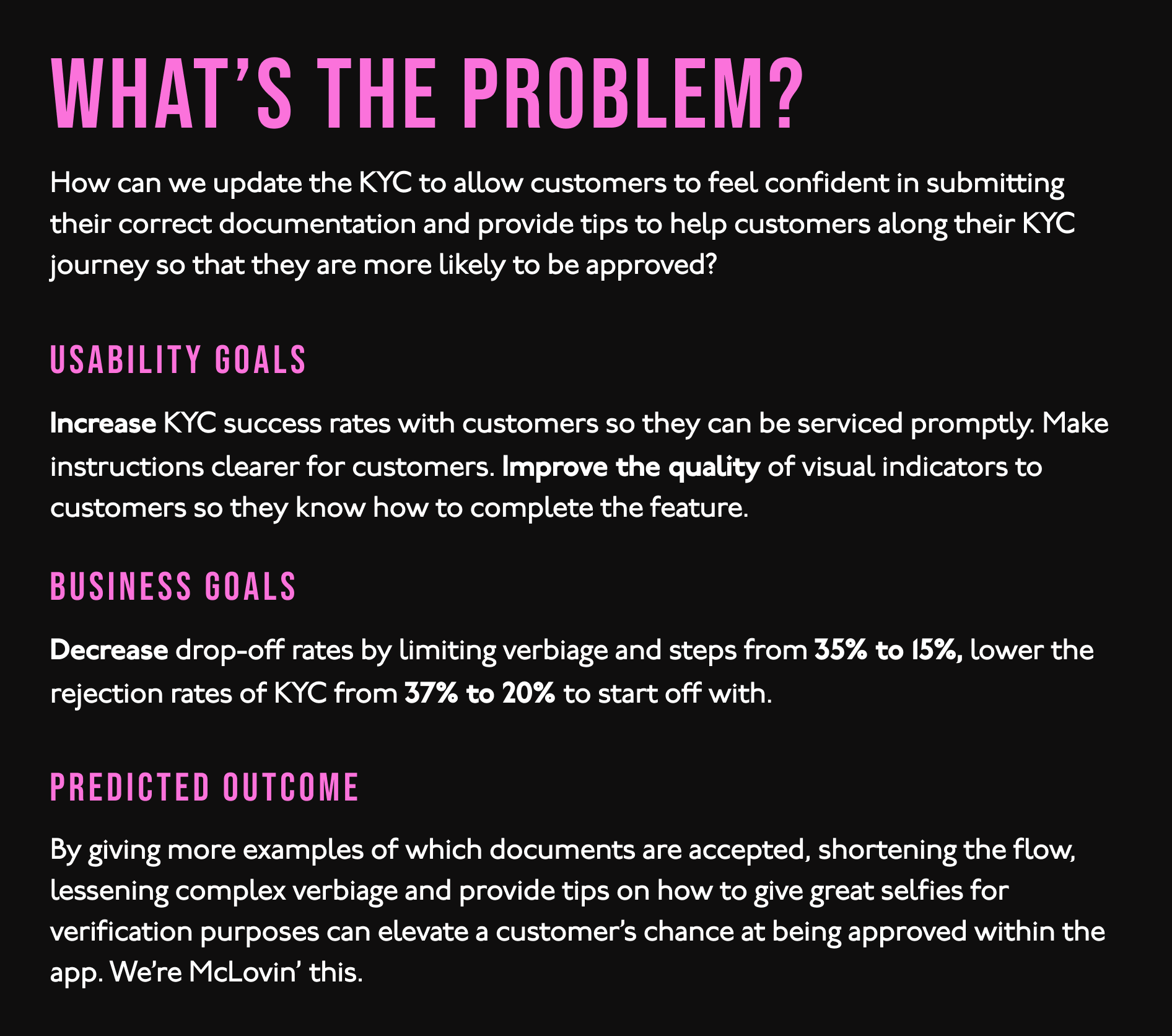
How can we update the KYC to allow customers to feel confident in submitting their correct documentation and provide tips to help customers along their KYC journey so that they are more likely to be approved?
Usability goals: Increase KYC success rates with customers so they can be serviced promptly. Make instructions clearer for customers. Improve the quality of visual indicators to customers so they know how to complete the feature.
Business goals: Decrease drop-off rates by limiting verbiage and steps from 35% to 15%, lower the rejection rates of KYC from 37% to 20% to start off with.
Predicted outcome: By shortening the flow, lessening complex verbiage, more visual versus reading can help people not grow fatigue to completing their KYC. By giving more examples within apps of which documents are accepted and tips on how to give great selfies for verification purposes can elevate a customer’s chance at being approved within the app.
Cookin’ up the UX flow
Before any design work happened, I partnered with the UX research team in PH and Kenya to understand customer pain points more closely. Customers kept speaking about having more visual indicators through the process to help them understand what documents failed, where they were within the KYC process, and helpful tips to how they should take their selfie with correct ID. It was also called out having the ability to save progress or documents if drop off had to occur for whatever reason.
For the flow, the element of the topic was “less is more”, if there were fewer screens within the flow, it might save cognitive overload for drop-off that’s done on purpose because the application process is incredibly lengthy. With tips, both written and UX design might help users understand where they can fail. Creating a drop-off screen that indicates to the user where they need to finish their application. While the user may go in order of documentation upload, I decided to leave it open-ended for the user to start at any step they wanted to upload documents
I also wanted to focus on having the user have the ability to return to the overview screen in case they want to re-upload their documents.
KYC UX Flow
Finishing touches on UI
After confirming UX design work with stakeholders, I started to focus on updating the UI to Tala’s new standards for mobile. For mobile, it was only certain UI elements such as colors and icons that was to be updated. I also with the help of in-country market teams, wrote UX copy that was easier to understand.
On the side of this project I worked with the design team to help establish and kick off the ideation of applying our rebrand across the board to our mobile app and also creating a higher level design system that could be more uniformed across all design aspects Tala created.
User Testing
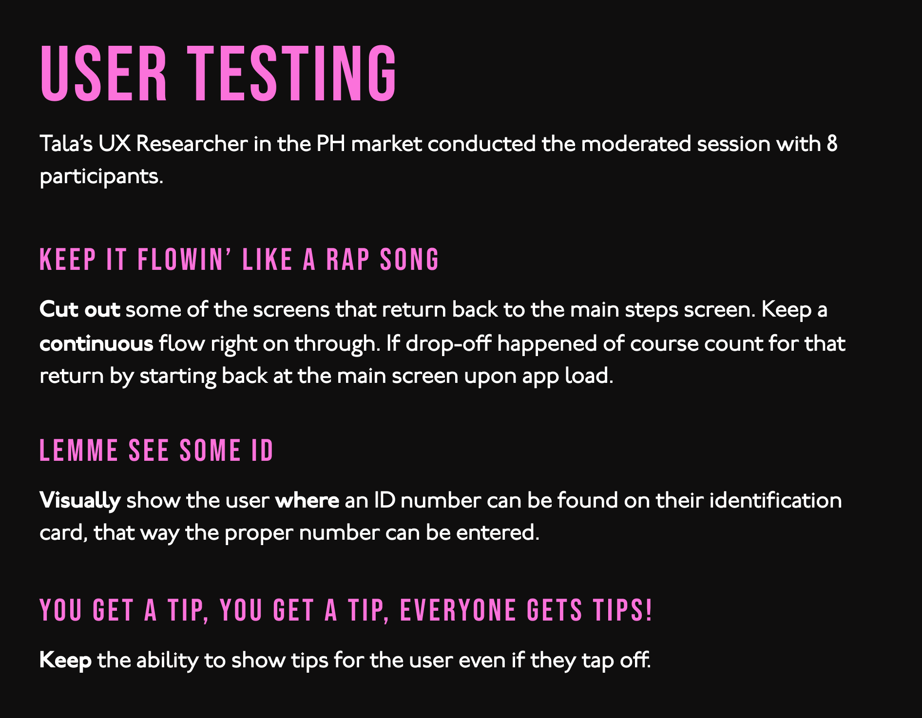
Tala user-tested in PH only (as the design was being first rolled out there), to understand if users had any issues or feedback for changes. Tala’s UX Researcher in the PH market conducted the unmoderated session with 8 participants.
Keep it flowin’ like a rap song: Cut out some of the screens that return back to the main steps screen. Keep a continuous flow right on through. If drop-off happened of course count for that return by starting back at the main screen upon app load.
Lemme see some ID: Visually show the user where an ID number can be found on their identification card, that way the proper number can be entered.
You get a tip, you get a tip, everyone gets tips!: Keep the ability to show tips for the user even if they tap off.
Design Updates & Launch
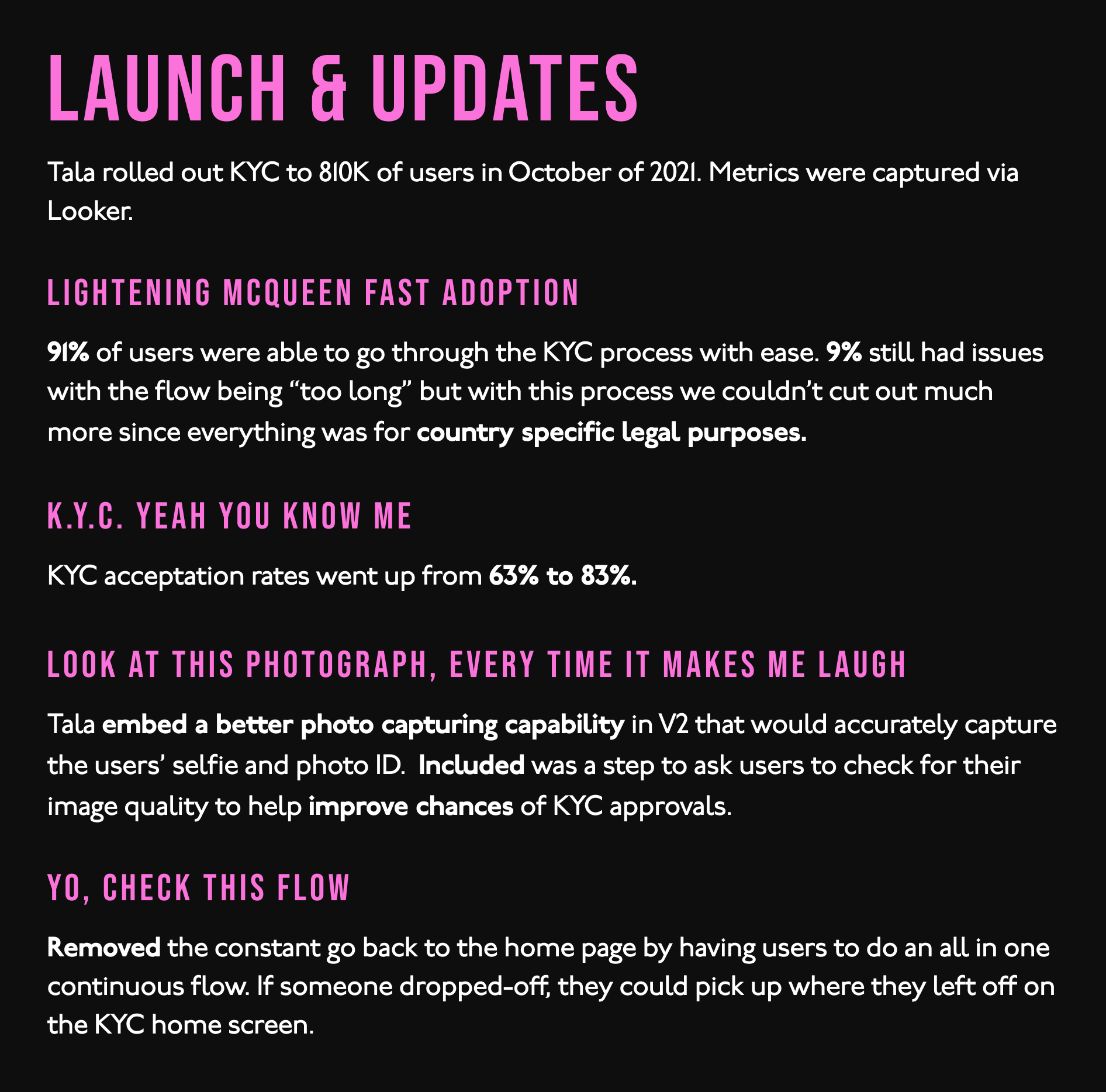
Tala rolled out KYC to 810K of users in Fall of 2021:
Lightening McQueen fast adoption: 91% of users were able to go through the KYC process with ease. 9% still had issues with the flow being “too long” but with this KYC process we couldn’t cut out much more as this information is all needed for verification purposes.
K.Y.C., yeah you know me: KYC acception rates went up from 63% to 83%.
Look at this photograph, every time it makes me laugh: Tala embed a better photo capturing capability in V2 that would accurately capture the users’ selfie and photo ID better. Also included was a step to ask users to check for their image quality to help improve their chances of getting approved KYC.
Yo, check this flow: There was the decision to remove the constant go back to the KYC home screen and focused on having people select their ID type first rather than giving them the option to jump steps if they wished.