United Airlines
MilePlay, originally launched by United in 2019, is a gamification program designed to boost customer engagement and drive loyalty. It generates $6M+ annually through three types of targeted challenges, rewarding users with bonus miles, seat upgrades, and complimentary food and drinks — all personalized based on customer travel profiles and tailored toward frequent flyers. United’s marketing team tapped me to rebrand MilePlay with refreshed visuals and UX to align with the app’s new look and feel. Hey now, you’re an all star, get your game on, go play. 💫
Available on the Apple App Store and Google Play Store.
As the self-proclaimed ‘rebrand queen’ wrestling to establish dominance with the rebrand efforts for mobile proved to be a challenge in its self. I was one of the first designers to go home with altering an already existing feature in the United app with the new rebrand. I mean no pressure, right?
Need a TLDR; versionDesign was riddled with lengthy corporate jargon language, which caused confusion by 52% of customers.
wave the white flag33% of customers said they would give up the challenge based on forgetting they started them or the challenges were too hard to complete.
What’s in it for me?Customers loved incentives that would drive them to keep going with the challenges. They liked challenges that offered flight discounts or similar discounts on other flight reward platforms (Ex: Chase Travel)
How can the MilePlay feature reflect new branding standard while also creating a more intuitive brand loyalty and accessible experience?
usability goalsEnsure that users can easily understand and track their progress within the MilePlay challenges, clearly comprehend what actions were required to complete activities and navigation the interface effortlessly to find necessary information.
business goalsIncrease user engagement with the game by updating the experience with new branding, encourage users to redeem their reward codes more effectively and introduce new challenge types for customers to complete. If you ask me the Wade Bogg’s challenge a la It’s Always Sunny in Philadelphia would’ve been a hit.
Predicted outcomeBy applying the rebrand, more customers would be enticed to interact with the United brand. With upgrades to both the UI and UX, the game challenges customers would have a better chance at completing the challenges, thus racking up moment and start to play for bigger rewards.
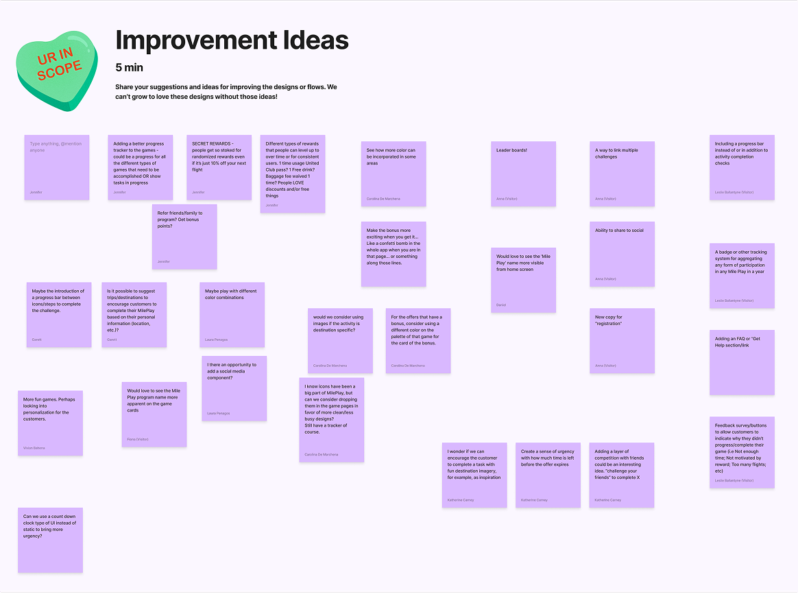
Before diving into the design process, the team began with a virtual Figjam workshop to assess current and future needs for MilePlay. Here’s some of those ideas ID’d in the workshop. This was where I also brought in some examples of apps/companies that had successful reward programs for their users.
We know what you likeNew game types based on user preferences to reach newer audiences.
VIP AccessNew rewards types like free Polaris lounge access, were considered cool but deemed out of scope for the initial release.
Trackin’ the ScoreStylize the progress bars to match the game types.
Newbies WelcomedTarget new users to the United brand by offering low stakes challenges.
The process kicked off with a virtual FigJam workshop to assess current and future needs for MilePlay, surfacing ideas like new game types based on user preferences, stylized progress bars matched to each game type, and new reward types like Polaris lounge access — all cool, some out of scope.
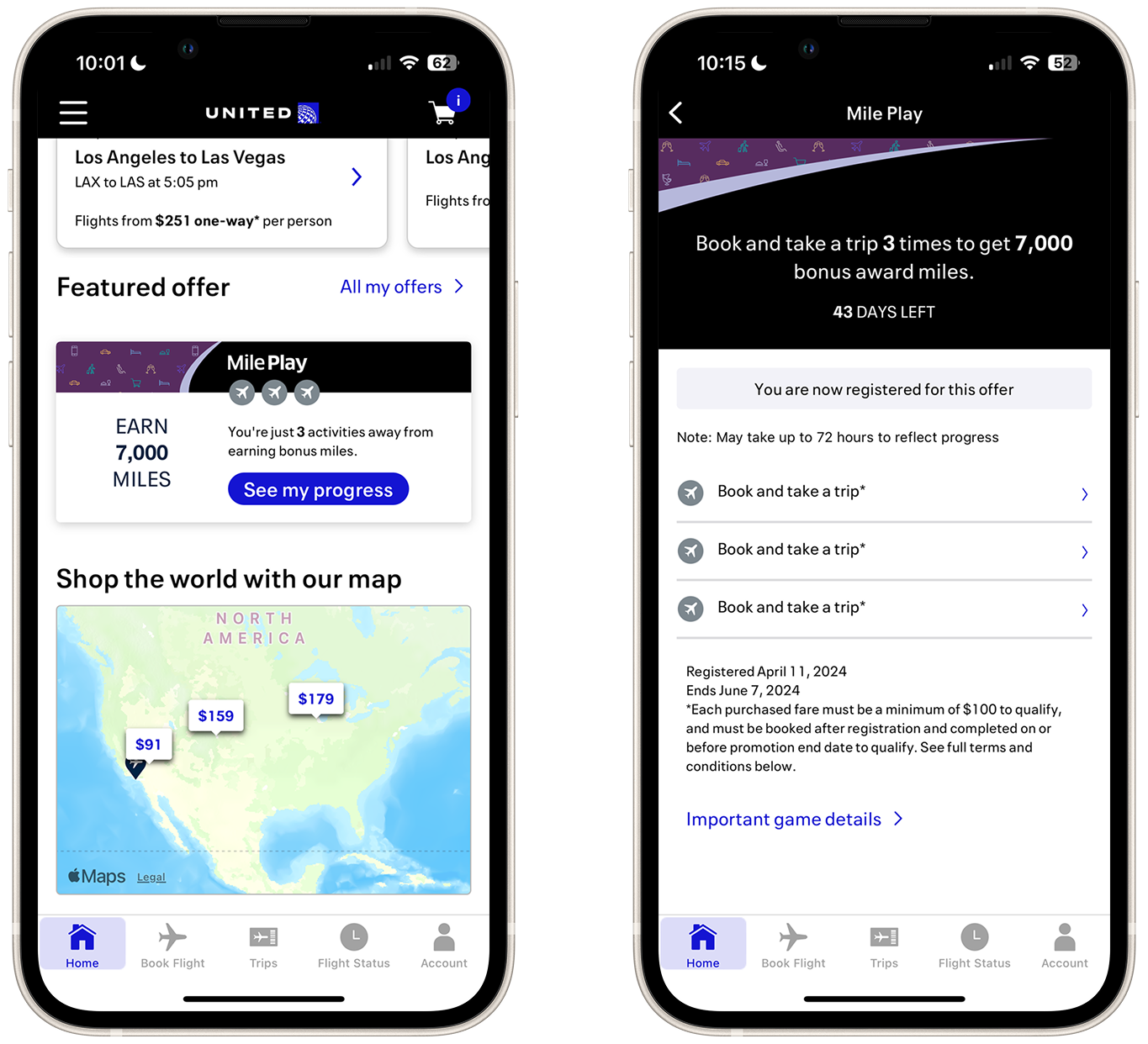
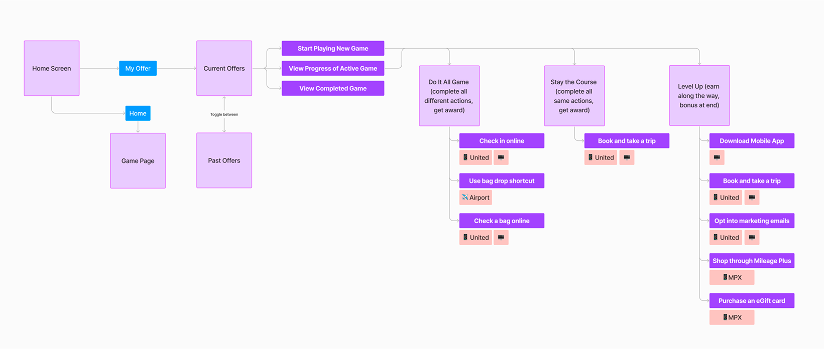
From there, the team compiled a UX flowchart mapping how MilePlay works and how users earn rewards, then shifted focus to redesigning challenge entry points across the app home and offers page, surfacing key info like time remaining, progress, and rewards through updated cards. UX improvements were also proposed to simplify gameplay and make task participation and progress tracking more intuitive.
Before starting design work, I mapped out how each game flows to certain pages within the app experience on the mobile website of United.
Color schemes were developed from rebrand variations, using strategic highlights and animation to drive participation. Since After Effects and I have beef, a brand designer handled the motion—capping animations at three seconds with a single play to stay accessibility-compliant.
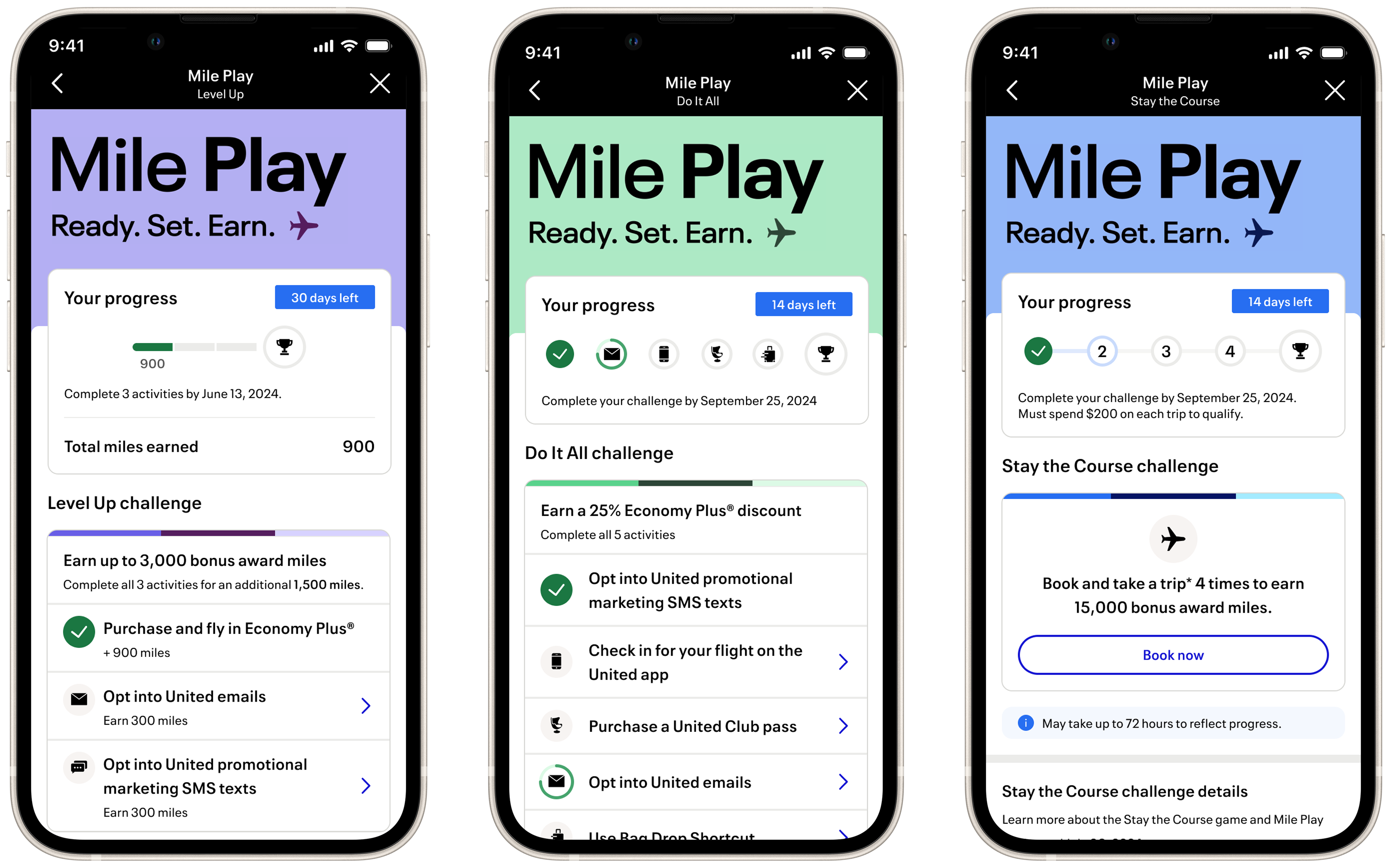
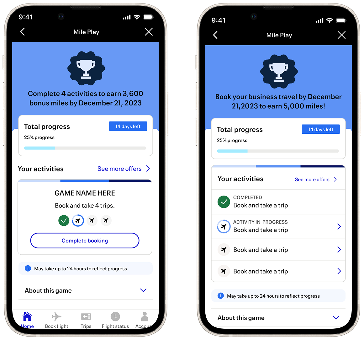
Complete the same activity multiple times to snag the big reward. Given the repetitive nature of these challenges, we used a numerical tracking system so customers can easily see exactly how many reps they have left.
Complete activities to win rewards as you go, plus a bonus for finishing the set. In Level Up challenges, users earn miles for every game completed. We designed a segmented progress line with numerical annotations to help them visually track their mounting rewards.
Complete every activity to win the prize. In this challenge, users tackle unique tasks but only unlock the reward at the very end. We utilized system icons to clearly represent which activities are in progress and which are still waiting to be tackled.
Features a single activity card, designed to make it clear to users that they only need to complete one type of activity
Wireframes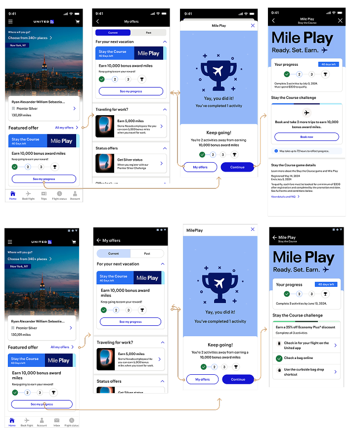
Divides activities into different block links, allowing users to see how much they can earn for each type.
Wireframes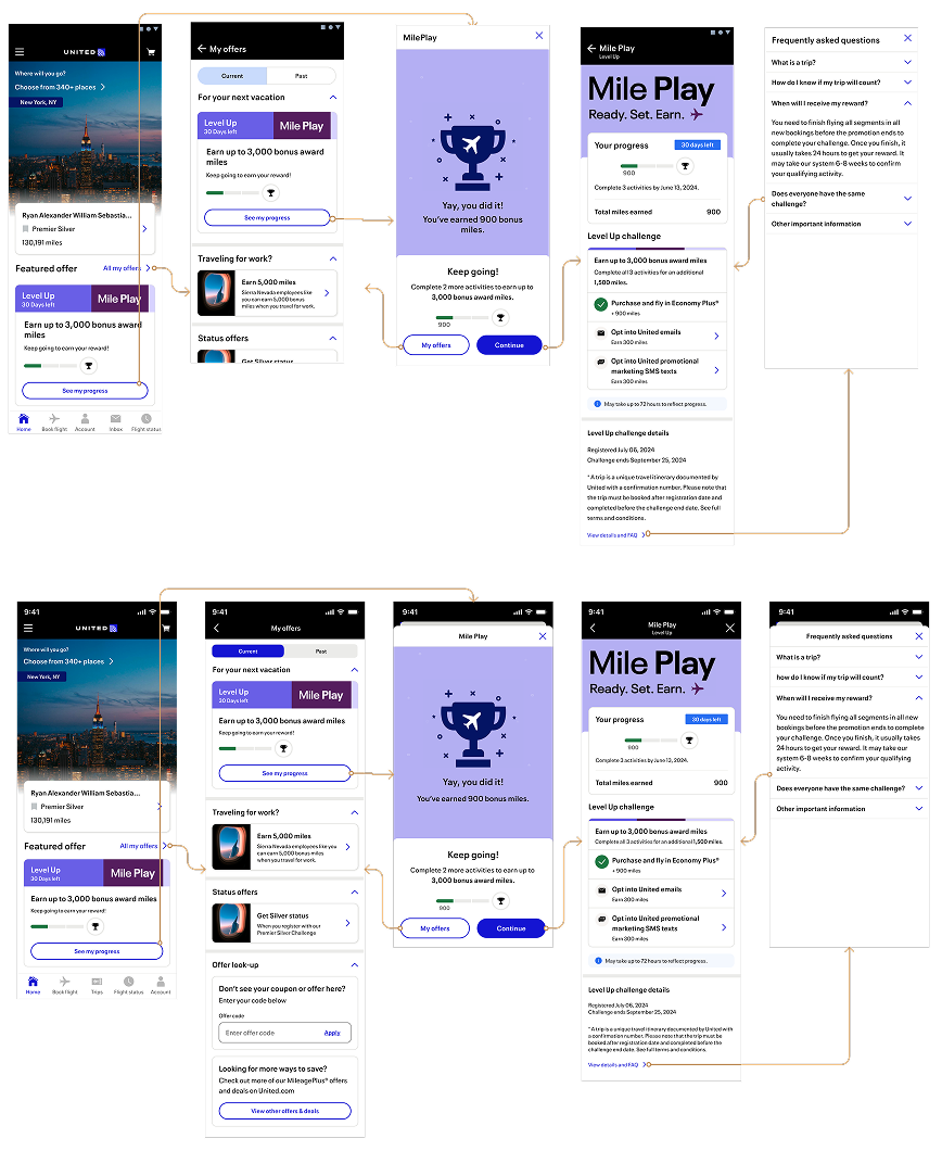
Similar to Level Up, but without the numerical annotations since rewards aren’t issued mid-challenge. Instead, we implemented a clean checklist to help users track their journey and ensure they cross the finish line
Wireframes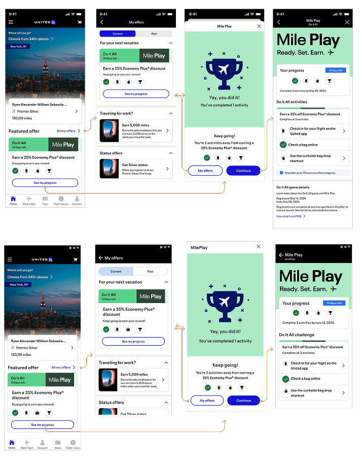

User testing was done using a moderated session on usertesting.com with 9 participants
Got it, chief7/9 participants found the progress bars easy to understand and the actions needed to complete the challenges were clear.
Let’s get physicalThe games were perceived more as fitness challenges, similar to Fitbit, rather than traditional gamification.
Faqs on faqsParticipants still found the FAQ section overly legalistic and challenging to navigate, particularly when trying to find specific answers.
trippin’ on tripsParticipants struggled with understanding what constituted a ‘trip’ within the challenges. do I book the trip and get my points or do I book and take the trip then get my points after I do both actions?
MilePlay released in September 2024 on the United Airlines app and website. Below are the outcomes that were predicted.
Who are you people?With a more approachable design, the design aimed to attract new users to the challenges and brand loyalty.
flying high with bookingsAnticipated a rise in flight bookings that contributed to user challenges especially with Stay the Course as the most common/popular revenue generation challenge.
decode thisEnhanced clarity around reward codes leading to increased usage, encouraging users to participate in more MilePlay challenges.
Woah! dream big!Thoughts from the workshop brought up a few future feature enhancements. Allowing users to combine miles earned through MilePlay to transfer to other MileagePlus members. Introducing a leaderboard to motivate users to engage more frequently with the challenges were another idea brought up.
Making flights tolerable from crying kids, Karen’s and turbulence by completing onboard drinking challenges was my idea but I got told my idea was too damn good to use.